Wednesday 30 September 2015

Getting to know Photograpy

Week Five - Lens Based Media

The camera is a powerful tool for creating imagery that evokes meaning and emotion

Today we were given a brief introduction into the lens based media course. We had been shown a series of thought provoking photography and short films. each had a very powerful meaning behind them which I particularly found beautiful. For today's lesson we were asked to bring in 10 pictures of our surroundings and what is important to us. However when we started the class, we were told we only needed one photo, and our task was to replicate the photo onto a larger scale of A1. 
Own Photo - My Bedroom
I chose this picture to use because of the interesting composition of light. However, when I think even more deeply, I realize that it may be due to the idea of comfort. My bedroom, a place of privacy and a place to escape the outside.
Own Work - Drawing From a Photograph
After drawing the picture, we were asked to crop sections to portray different feelings like John Hilliard's - Cause of Death c1970
Own Work - Isolation
Own Work - Guidance
Own Work - Comfort
The first one represents isolation, by focusing on the corner of the room; like it closing in on you. The second one represents guidance, by focusing on the lamp, it portrays the idea of light and how it helps you see and guides you. The third one represents comfort, this is focused on my bed, a place I feel safe and calm. I am quite happy with my work as it linked quite well into each other. Only criticism would be for e to start using thing bold colours and materials when it comes to large drawings.

In the afternoon we had an introduction to the camera, we looked at how the camera works with lighting in the studio space, we also learnt how to minimize light, sharpen shots and was shown a brief slide show on where lens based media could take you.

Tuesday 29 September 2015

Working with Your Own Graphics

Week Four - Graphics

How to portray your poem through poetic migration

Today was based purely on building your final A3 piece poster for your poem and your personal take on poetic migration. this task excited me in particular, because I love making things with background stories and unraveling tales that can come across ambiguous. For me, the poem '754' by Emily Dickinson can be interpreted in many ways.

Own Work - Poetic Migration Poster
My Life had stood - a Loaded Gun -
In Corners - till a Day
The Owner passed - identified -
And carried Me away -

And now We roam in Sovereign Woods -
And now We hunt the Doe -
And every time I speak for Him -
The Mountains straight reply -


And do I smile, such cordial light
Upon the Valley glow -
It is as a Vesuvian face
Had let its pleasure through -


And when at Night - Our good Day done -
I guard My Master's Head -
'Tis better than the Eider-Duck's
Deep Pillow - to have shared -


To foe of His - I'm deadly foe -
None stir the second time -
On whom I lay a Yellow Eye -
Or an emphatic Thumb -


Though I than He - may longer live
He longer must - than I -
For I have but the power to kill,
Without--the power to die--

Happy or sad, a celebration or even a cry for help, the poem can be interpreted in so many ways. In my poster I stared the base in the sunset in the woods, a helpless doe laying on the grass and to finish a pistol leaving a gun flowing though the whole poster and missing the doe, taking the opposite direction. I did this because I also wanted to portray an ambiguous message with the pistol direction bending; it also represents the idea of poetic migration through-out the movement. Following the direction of the bullet is the first few line of the poem, intended to leave the viewing in confusion of the juxtaposition. I chose to hand draw the whole image because I felt like it added the element of story telling, fiction.

Own Work - Original and Enlarged Posters

Monday 28 September 2015

The Art Of Graphics

Week Four - Graphics

Be individualistic in all you work..

Today lesson involved using mixed media, mark making and collage experiments. we started the lesson by taking out our different drawing materials, we then had to be placed opposite someone to do some observational drawings. We had four pieces of A4 paper and each would consist of different materials and drawing methods. 
Own Work -  No.1 Blind Drawing
My first drawing was a blind pencil drawing. When I opened my eyes, I was quite shocked at the composition, however I didn't hate it, I thought it was quite interesting, because all the body parts are there, just not in the right place or order

Own Work - No.2 Left Handed Pen Drawing
 This drawing was drawn using the hand opposite to my writing hand. I really liked this piece of work, even though it was extremely uncomfortable to use my left hand, I love how the lines are scruffy as it leaves an interesting texture to the drawing.

Own Work - No.3 Continuous Line Drawing
 For this piece I used a black felt tip pen, and drew in a continuous line without letting the en come off the paper. I didn't like the outcome to the image as it seems uneasy and too bold and confident. By using just the one line, I couldnt estimate the proportions correctly which is another regret.

Own Work - No.4 Mouth Drawing
In this drawing I used a fine tip pen using my mouth to draw. Even though it looks nothing like I would have imagined, I quite like it because it has a unique taste to it, it looks quite depressing and scary in a sense, it has that element of fright and fear. I really enjoyed doing these drawing as it helped me become more loose in my approach in my work.

Class Work Presented 
Our final observational drawing task was to draw an A1 ear. The ear was expected to have details, deep shading and to replicate the actual form of an ear. In my work I had used a fine line pen. when re- evaluating my choices I realize that it would have been better to use a deep prominent colour and material such a charcoal as it was expected in detail of such a large scale. However my work isn't bad, but i'm sure I could have done better if I had used charcoal or something similar.
Own Work - Observational Drawing Of Ear

Mark Making

Our second activity of the day was to use mixed media to do mark making. We were all designated a letter to replicate again and again in different form and with different techniques. My letter was 'R'.
So i took the initial idea of the flicky 'R', and began my first copy.

Own Work - Exploring Mark Making
The next task was to choose your most favourite design and enlarge it onto A4 paper. i chose the first one but also quite liked the last one too. So I had decided to mix them both by taking the swirly flicks from the first one, and then cutting inside the flicks like the last one. 

Own Work - Final 
I was really happy with the final outcome, I loved how the letter looked fluent and delicate with the flicks and neatly cut shapes. I thoroughly enjoyed this task. 


Sunday 27 September 2015

Poetic Migration

Week Four - Graphics

You are what goes through your mind..


Poetic migration, what is poetic migration and how can we explore the meaning? We started the introduction by exploring the meaning of 'poetic migration', what it could possibly mean to us individually. We started by doing a brief brainstorm and from there continued to make connection no matter how random it may end up.
Own Work -  What Is Poetic Migration
After coming to a finish of our brainstorm of what poetic migration is we then were asked to write our individual lines of poetry. The idea would have come from the influence of the brainstorm. Once we all had our lines of poetry we were asked to mix them together with the people on our table to make one full poem. We tried to link the themes together in each line that we had. Although it flowed well, I was quite disappoited that it was quite shot as we ran out of time before we could figure out how to construct the whole poem.
Own Group Work - Poetry Mix

Type Sheet
We all had our individually avourite poems that we had bring in so after writing and presenting our poetry we were given a type sheet and paper so that we could start to explore the different types. We each chose a word that related to our poems and were instructed to play with the type forms; mine was 'isolate' 'isolation', so I started experimenting with bold muted colours; usually one of the letter looked quite effective with one isolated different colour, such as red. I found this activity particularly interesting because I got to play around with hand typing compositions which is something I never got to experience in such detail before.

Own Work - Type Face Experimenting
We were then asked to pick our most favourite composition to blow up and present to the rest of the class, so I decided to choose (below) this one because of the muted tones and interesting composition of letters; almost as though each of the letters are having difficulties of seclusion. The letters in red stand out in particular and emphasizes further the idea of isolation and seclusion. I am quite pleased with the final outcome as it was a stand alone statement, and didn't need much else to make it anymore relevant than it already was.
Own Work - Final Composition.


Saturday 26 September 2015

The Bridge Test

Week Three - 3D Design and Architecture

What is around us?

There are many things around us that we take for granted; not many people take the time out to appreciate the time and physics put in today's architecture. Today's task was to take a look around and capture some stilted structures and bridges, after recording and taking the images we returned to class to receive a brief on our next task. We were then put into groups of 7 and asked to build a bridge, the bridge had to fill the criteria of being high enough for a folded table to go beneath it and smooth and stable enough for the remote control car to drive across it. The bridge also had to be both attractive and durable. The bridge also had the limitation of only two points touching the ground. Our equipment for the task consisted purely of 10 sheets of A2 cardboard, unlimited bamboo sticks and unlimited rubber bands.

We first started by building out steady points to hold the structure above the ground. We built it from bamboo sticks that we had taped together for more strength , we then tipped it upside down so that all the bamboo sticks come together to make one point by taping the bottom. we then made another alike and used it on corresponding ends of the bridge.
Group Work - Bridge Stabilizer 
After making these basics, we started exploring through the different ideas for the final piece, and how the bridge should be structured.
Group Work - Bridge Plan
We then started to build the basic structure and then started thinking about the decorations. the group had many ideas of what we could do, so we started going through the pictures we had collected earlier today and then began to have a clearer idea of what we could decorate with. 
 Group Work - Final Touch
We started to use a teamwork method of two people cutting out triangular shapes, then the next 3 people designed the triangle but cutting out different geometric shapes, finally the last two people assembles the finished triangles onto the bridge in an arching manner like a tunnel.
For the absolute finally we assembled some rubber bands like most bridges it left quite an authentic bridge feel to it. 
Group Work - Final Piece
All in all I was extremely proud of our bridge, everyone worked well as a team and the final product was admirable. It resembled a really well stable and attractive bridge that both functioned correctly and was aesthetically pleasing.

The Experiment

The remote control car test. Had a rough journey back.

Friday 25 September 2015

Can you make it pretty and durable?

Week Three - 3D Design and Architecture

Building Supports

Own Work - Water Bottle Support
We were asked to build a support for a water bottle. The support had to both function well and look aesthetically pleasing. The support had to lift the bottle 20cm's high.
I was quite disappointed decisions in the way in looked however it covered the function criteria. I used a fan base held up by a 25cm long tube. We then put the supports to the test and mine had passed honorably. Finally we were asked to measure the support up to a building size, by placing a miniature human model by the piece and then to photograph them.
As a support for a water bottle, I was not please with the looks however, looking at it as a building, I feel that the look fills the criteria for a new modern building.

Afterwards we were then asked to build another support, however it was for our self and had to lift us 30cm off from the ground. We had to think strategically about how to build the piece so that it could support our body and not collapse but hold us up. We were provided 4 pieces A2 cardboard and then went off independently to work on our pieces. I decided to build a solid block and to make it look attractive I wrapped brown tape around the seat and then cut out downward arrows.

After constructing the piece, I tried putting the seat to the test and got someone to sit on top of it to see if it will hold up. The seat turned out surprisingly strong. I was happy with outcome however, I was then concerned about the general looks of the piece as it looked rather messy.

Own Work - Body Support Final Piece


Thursday 24 September 2015

The art of 3D design

Week Three - 3D Design and Architecture

How we interact with objects and forms.

Utilizing methods that can instigate innovative and individual designs to fulfill specific purposes. This week is based on the how structure and forms are used for both the eye and the functions. we started the week off with a brief introduction to the course. 
Own Work - Scribble Seat Support
We started off with brief drawings; the first task was to do a random scribble then develop it into a support for two people and a cat. The size of the people and cat determined the scale of how large the support was. I wasn't happy with the overall outcome, however it helped me in understanding how structure can be developed through the most simplest forms
Own Work - Shoe Lamp
After we were asked to continue with our imaginative responses so we were asked to pick our favorite choice of clothing and make it into a light source.
I chose a shoe and then made it into a lamp, however I was not pleased with the outcomes due to the odd compositions and the displacement of the center of gravity. Looking back, I think I could have improved this by removing the heal of the shoe and the stalk of the lamp. 

Interior Architecture

 Our next  task was to draw nine random dots and then join them together to create a typical one floor house plan; including the important rooms. There were a few rules as to where the toilet and bathroom were to be placed  which was ideally two doors a apart. i thought that this had worked particularly well (Left picture) as the plan looked well drawn and professional. The right picture was drawn of  floor plan in an attempt of a shopping center. this however did not turn out well as I had run out of time and could not rectify my mistakes.

Own Work - Vehicle
 we were asked to draw three shapes; a triangle, circle and square to whatever ratio we please. We were then asked to use the shapes together to create a vehicle. I was extremely disappointed with my work as after I had composed the vehicle my ideas started to arise. If I were to redo the piece, instead of using the shapes as a support, I would use the shapes to be hollow with space inside to allow the driver to store and settle inside, much like the interior of a car.

Own Work - Random shape shoe design
In this task we were asked to draw two random shapes and then from the shapes, make it into a pair of shoes. This did not work particularly well because instead of using an landscape view, I constructed in terms of a birds eye view. I don't particularly like the outcome as it does no even remotely resemble a pair of shoes.

Own Work - Rabbits Den
The next task was to pick our favourite fruit and then to construct it into a rabbit's den. I had chosen a strawberry and then separated the interior into three floors where new activities lie.
I was quite proud of this piece because it looked well thought out and aesthetically pleasing.

Own Work - Music Player 
The final drawing task of the day was to use out imagination to make a unconventional music player, it could have function that does not exist in the real world. This task really queued my interest in how I could make something aesthetically please and multi-functional. My piece that i had designed works as a super sound earphone that equals the music between each ear through one gadget. It consists of multi touch screens, volume buttons, touch hollogram's and music display writing. It also works for mini portable CD's. I was quite pleased with the outcome, as in it was both ambitious and pushed me out of my confined comfort zone. 


Wednesday 23 September 2015

Kandinsky 'Orange'

Final Piece

When constructing my final piece I adamant to use unusual materials; as my composition consisted of circles I decided to use cupcake cases to create the base of the accessory. In doing so it left an angelic feeling to it, looking soft and feathery, so I decided to use that as my background for my Kandinsky inspired drawings. My final piece consisted of big bold geometric shapes that were both three dimensional and saturated in colour. 

Own Work - Wassily Kandinsky 'Orange' Inspired Work
When constructing the piece I felt quite disheartened towards it as I looked around and saw the various amazing ideas that ran around the classroom; mine seemed boring and far too simple; however as I kept adding elements towards the piece it started to look more and more like Kandinsky's work and therefore I was quite pleased that I  had completed the criteria and overall was happy at the final composition of how everything had worked well together.

Own Work - Final Piece


Tuesday 22 September 2015

Constructing our final ideas

Week Two - Fashion and Textiles

Today's activities consisted of constant development towards our final pieces. we were asked to bring in five photocopies of models for our fashion illustrations, we then started doing paper designs on top of the models in inspiration from our chosen artwork. I decided to replicate Kandinsky's use of shapes as a base of structure in my work.
Own Work - 3D illustrations
This piece of work was aesthetically  pleasing however was not useful in helping me come up with a final piece as the ideas came across ambivalent and widely diverse thereby leaving me with no direction.
We were then asked to print out copies of our artwork, in different sizes and then start creating stencil cutouts to use as a guide to create  20 more design ideas.
Kandinsky's 'Orange' artwork in fashion cutouts form
This worked particularly well because I was then able to understand that I could be selective about what I put into my final piece including colour and patterns; whether I want it to busy or simple.
The final task of the day was then to create another 20 fashion illustrations. 
by doing this I started developing my ideas and a solid formed outcome.
Own work on final fashion illustrations
This worked particularly well because I then started to think more seriously about structure and how it would typically hold up, I also allowed room to think about how it could have possibly been constructed and also the overall link to my chosen artwork. by using this format i was easily able to weigh out the pros and cons when coming to my final conclusion at illustration no.20
Own Work - Final Composition
My collar piece is constructed in the shape of a scarf but used and functions as a necklace.

Monday 21 September 2015

What influences your fashion?

Week Two - Fashion and Textiles


This week was purely based on the idea of wearable art. An insight of the routes of fashion. It is not just how a garment looks, but the brainstorm and initial ideas taken forward to create a garment. Our task for the week was to choose our favourite piece of artwork. I had chosen a piece by Kandinsky. Our artwork that we had chose had to somehow be something that had influenced us in some way or that we had felt fond towards; most likely should say something about our personality.
Wassily Kandinsky 'Orange'
To me this piece felt like it represented me, the sharp, cleanly cut shapes all mashed together, representing my neat and tidy traits that tend to get messy and confusing even though I may seem i'm thinking straight. I particularly liked this composition due to the separation of objects around the edges then the clash occurring into the middle. The bright colours and random lines also add another element of anonymousity, leaving the viewers confused of what exactly the artist is trying to portray.

Our first task was to create miniature 3D paper sculptures inspired by our artwork.
Own Work - 3D Samples
we were then asked to choose the piece that we had favourited the most and start to build it onto a larger scale
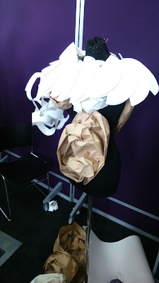
Shortly after everyone had created their pieces, we were all asked to get into small groups of three and take a mannequin between us. Our first task was to create something on the mannequin inspired by the word "flamboyant" using all three of our pieces together. We then were asked to move to another groups mannequin and use their pieces to create another garment based on the music they had played.

Flamboyant

First Rotation

Second Rotation

Third Roation

Fourth Rotation

After the fourth rotation we were asked to return to our original mannequin and to create a final piece with our own pieces.


I was really pleased with the final composition. all the pieces work really well together and create lovely team when put together.